Decorating a rental property to our own taste does have its challenges, especially if it comes fully or partly furnished. But it is completely possible to do a rental home makeover on a budget, if you get creative with your resources.
Most landlords are looking for reliable tenants who will take good care of the property, so showing an interest in the decor can be viewed as a positive trait. Many owners are willing to allow tenants to repaint and will consider removing some furniture too. They may set some restrictions around colour selection or require it to be returned to a neutral colour when moving out, but it is always worth discussing possibilities as repainting alone can make a dramatic change to the look and feel of your rental home.
Other suggestions – if they will make improvements to the functionality of the property – may also be welcomed, eg putting up curtains over draughty doorways, adding shelving etc.
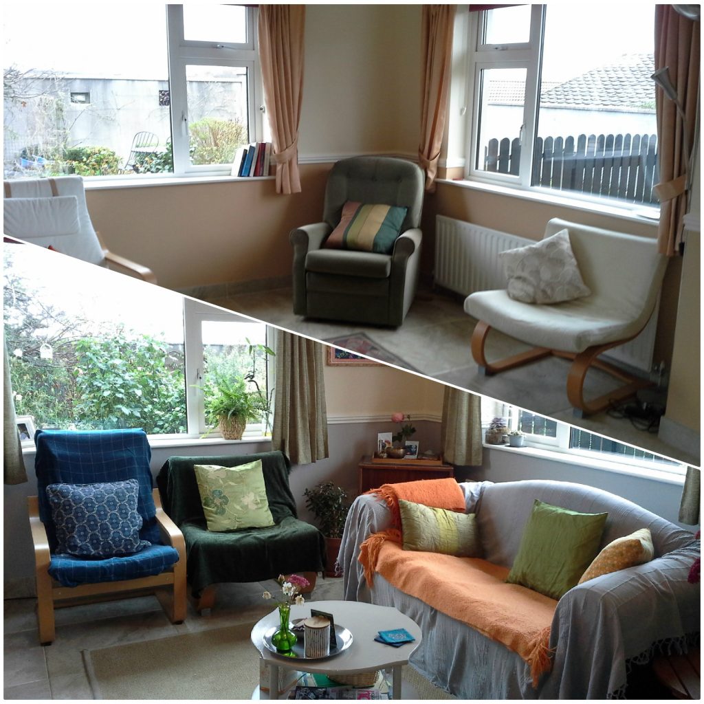
My most recent home. (I move a lot.)
This is my current rental home and I was working with a limited budget – and some furniture that comes with it. However, I’m blessed with an amenable landlady who allowed repainting according to my own taste, and who also welcomed additional suggested improvements.
My home doesn’t look like a contender for the front cover of a magazine….but I like it that way. (I can make yours look like one though, if you want.)
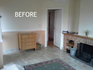
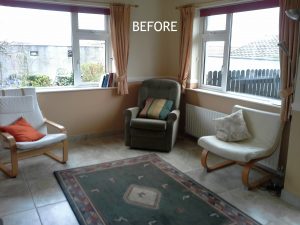
The “Before” photos were taken on moving-in day (before I brought in any of my own stuff) and the rug belonged to the previous resident, so that was not something to be kept in the scheme. I had some furniture but more was sourced over time. When you move into a new space – and especially when working with small budgets – slow decor is advisable. Spend some time living in the space to get a clear idea of what functional improvements need to be made to suit how you like to live. With this clarity you can start searching for pieces that suit your taste, based on how they will meet your needs and fit your space.
Rushing out to buy items to immediately create the aesthetic you want may result in acquiring pieces that will ultimately create problems around how your new home actually functions for you, day to day. So, resist that urge and take your time. This also increases your chances of sourcing what you need at lower prices. (In this room, almost everything I added was sourced second-hand.)
My Style – and what I wanted to do with the place.
I’d describe my style as vintage eclectic, and while I’m very drawn to mid-century pieces in particular, I also appreciate a wide range of styles – including modern. Over the last couple of years I’ve found myself moving a little towards minimalism (although nowhere near purism), but still like the cosiness of a bohemian vibe.
Straight-off, I knew I wanted to change the colour of the room and the dated curtains, acquire a sofa and get rid of at least one of the armchairs as there wouldn’t be enough space for them all once a sofa was put in. The (draughty) front door opens right into the living room, which is also open to the kitchen. There are two big windows in this room too and the floor is tiled. With this in mind I wanted to create a visually cosy feel through a mix of textures and some warm colour.
I also wasn’t keen on the dado rail as the house is not a period property and it felt out of place (and I wasn’t a fan of the biscuity colour below it). Initially I was thinking of painting the full wall in one colour so the dado rail would blend away and be less obvious. However, taking my chosen colour palette and the direction of the natural light into consideration, I decided against that.
The Colour Palette.
The inspiration for the colour palette was an original painting in blue and green – a mandala of the Buddhist mantra Om Mani Padme Hum.
Green and blue are both calm-inducing colours, but they are also on the cooler end of the spectrum. This living room has a dual perspective, with one window north-east facing and the other south-east facing. The south-east window does bring in warm light in the morning, but from afternoon onwards – and in winter – the room has a duller light coming in.
The living room also opens onto the kitchen which had a burnt-orange wall that I love and wanted to keep. Orange works well with both green and blue (the three together form a split-complementary scheme). However, to paint the whole wall in either green or blue would have made the living room feel quite cold in the evenings. Ruling out green or blue walls, I was looking for a neutral option that would work with the green/blue/orange scheme.
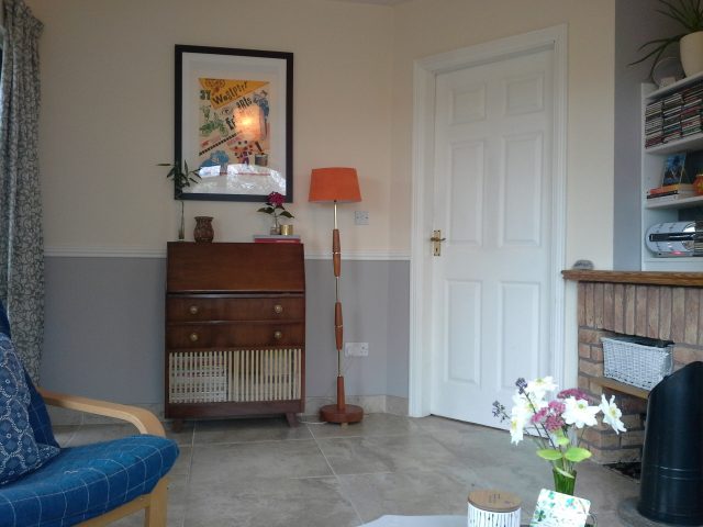
After some deliberation, I decided to keep the magnolia wall above the dado rail (it was recently painted and didn’t need redoing), and to paint below with a contemporary grey. To do the whole wall in magnolia felt a bit dated, and to do it all in grey would have had the same cooling effect as the green or blue. But combining the grey with the magnolia brings the neutral backdrop more up to date. And the grey against the white looks smart and makes the dado rail feel less dated than in the previous scheme.
Furnishings and Décor.
Although I would have preferred floor length curtains, with the radiator sitting below one of the windows I didn’t want to block the heat through long curtains drawn on winter evenings (especially with the front door opening in to the living room). I did begin a hunt for affordable floor length curtains to be hung above the door and had a bargain second-hand find for machine washable, lined curtains in an off-white. They didn’t work against the magnolia wall, so I dyed them olive green – the dye picked out the embossed pattern in the fabric and the overall effect was a pair of curtains that looked far more expensive than the original, and cost a total of €32 (including the cost of the dye).
The sofa was also a bargain find – a barely-used two-seater, it was in great condition but had a dated pattern on the seat and back. This would be more of a problem for someone who wants modern, clean lines. But for someone who likes a Boho touch, compromises can be made here – as long as the piece is of good enough quality to meet the functional need. A throw hides the pattern and can be chosen in whatever colour works with the overall palette. You can even switch out the look from season to season, or whenever you get bored, by simply swapping the throw.
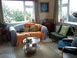 Once I sourced the sofa, my landlady kindly removed the old recliner armchair. I put throws on the other armchairs (the day I moved in) – not to hide the cream covers but to protect them from my black cat’s hair. Essentially, the green, blue and orange colour palette was applied through these soft furnishings and artwork.
The green curtains for both windows were another bargain find and only cost €5 for both pairs! While I was seeking curtains that wouldn’t cover the radiator, these are shorter than I’d like and I’m keeping an eye out for something better. But in the meantime, I do like the colour and fabric and they’re quite an upgrade (not to mention update) on the previous curtains which were probably there since the house was first built (twenty years ago).
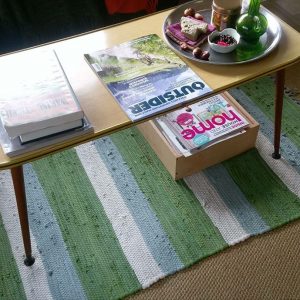 The jute rug came with the house (lying beneath the previous resident’s rug in the ‘Before’ picture). I go through phases of layering a smaller green, blue and white striped rug over it, but at the moment I’m sporting the more minimal look. When I bought the sofa, the lady threw in this 70’s coffee table – I didn’t really want it at the time, but I did need a coffee table and took it as an interim measure. When I put it in place I really liked it – it fit the vintage vibe perfectly.
Over time it proved not so practical and I really wanted a coffee table with a shelf underneath (preferably a round one to offset all the angular shapes in the room). I still haven’t found the perfect one, but I did find another 70’s coffee table with a shelf beneath which I painted. I’m not mad keen on the pointy corners, but as an interim measure it’s more practical.
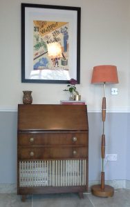 I have had a mid-century record cupboard for over two decades now and the combination of the various pieces was starting to bring about that vintage vibe, without being too rigidly attached to any one particular style. I fell in love with this 1940’s bureau and placed that inside the front door, moving the chest of drawers that started out there into the bedroom.
Although I didn’t need a standard lamp, I couldn’t pass up this 70’s lamp I spotted in a local charity shop for just €7. I’ve been searching for the right shade ever since and as an interim measure I got this cream shade (it was cream when I bought it) in our local Homeland store, for another €7. It needed some contrast against the magnolia wall, so until I find the perfect shade (or I might cover this one in fabric), I have painted it orange (with left-over paint from the kitchen that I found in the shed).
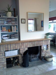 Initially I planned to install shelves in the alcove beside the fireplace (with my landlady’s blessing). But I’ve had a simple low book case (the first flat-pack piece of furniture I ever built) for twenty odd years which is an almost perfect fit (there’s a couple of milimetres of a gap), and I spruced that up with a coat of white paint and lifted it into place.
For now I’m quite content with the living room. I do want a better coffee table and slightly longer curtains…and maybe a different rug. I don’t love the mirror above the fireplace (not mine) and I’d be lying if I didn’t admit that I’d replace the sofa for something more contemporary if I had a windfall. But with our homes we’ll always have tweaks and improvements we want to make. It keeps us from getting bored with our environment.
With or without these potential replacements, when I sit down to relax in this room and I look around, I am pleased with the electic mix and the overall vibe. Even with all the grey, blue and green the room has a warm, cosy feel thanks to all the orange splashes throughout and the mix of textures. In the summer it felt bright and welcoming and in the winter it feels cosy and inviting.
And (naturally) I rearrange the furniture regularly. (A great tip for a zero-cost makeover!)
If you’d like some tips on how to complete your own rental home makeover on a budget maybe one of my Pick My Brain sessions would be of benefit to you. If you’re interested, do get in touch. I provide them in person in west Mayo and Limerick city and suburbs, or online via Skype or Zoom.
