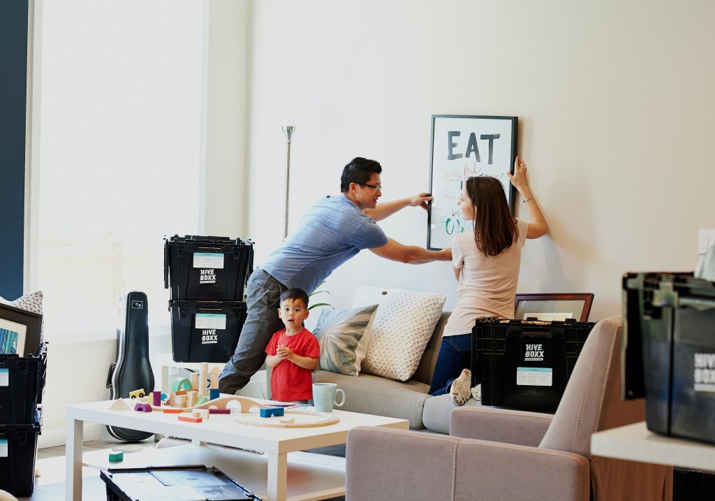
Photo by HiveBoxx on Unsplash
This is the second in a series of tips on home décor.
The crucial guideline in good interior design is this: form follows function. Meaning how well a space functions is the priority, and how it looks comes next.
And when it comes to a well-functioning space, room layout is key.
In tandem with that, we need the scale of all the furniture to be correct for the overall room size. Too big and it will eat up the space, minimising layout options and making it feel smaller than it is.
Too small and it can make a large space feel cavernous, or make a small space more obviously so.
Unfortunately, sometimes layout is determined by the size and shape of the room, not leaving many options to play around with (unless a renovation is on the cards). That said, whenever there is the space to do so, then play around with it you certainly should do!
Switching up the layout will instantly transform a room, and how it feels as well as how it looks.
The layout can help the room feel more intimate, or more formal. It can create an ease of circulation, or it can create obstacles that the household constantly has to work around. It can make the room simply work well. And it can turn it into an uninviting space that nobody feels drawn to spend time in.
Here’s some simple things to bear in mind when laying out the furniture in any space:
Is all your seating laid out against the walls?
Is it all facing the TV?
Does any of it create an obstacle that has to be awkwardly shifted around to move from one point to another?
Cure the Wall-itis
Whenever it is possible, pull your sofa and armchairs out from the walls, even if it’s only by a couple of inches. And arrange it in a considered way, to serve a particular function, rather than simply following the contours of the walls.
For example, if you want your living room to be a social space that invites conversation, then arrange the seating to encourage that, rather than pointing it all at the TV. You could go with a u-shaped seating arrangement, with a coffee table in the centre, or with two sofas directly facing each other (or one sofa and two armchairs facing each other ), again with a coffee table in between.
I find the u-shaped layout to be more casual (and can be largely conducive with TV viewing too). If you want a more formal feel, try directly opposing seating (using either sofas or chairs). And for something that feels somewhere in the middle, try one sofa and two chairs, but place the chairs at a slight angle rather than directly facing the sofa. It’s still very conducive to conversation but also feels more relaxed.
As an alternative to a center-placed coffee table, you could have side tables strategically placed so that from each seat there is a surface to put your cuppa on.
A third option, that works particularly well in a family TV room, is an L-shaped arrangement. You can achieve this with a sofa and armchair, or two sofas, as easily as with a corner sofa.
[masterslider id=”9″]
The key is to start with the function of the room, rather than the blank walls, and place the furniture in the way that will draw people in for that particular purpose.
Create a Focal Point
Some rooms come with an obvious focal point, such as a fireplace in a living room. Having an interesting feature that draws attention also helps to direct the room layout.
But if you don’t have an architectural feature, there are plenty of other options. It could be an eye-catching piece or art. Of course it can be the TV too, if that’s what the room is largely used for. In a non-TV-viewing living room that also doesn’t have a fireplace, it could be a wall unit with an attractive display of books, plants or ornaments. (I like to mix all three.)
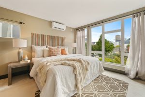
In the bedroom, you want it to be the bed. While this sounds obvious, it means laying out the room so that you can see the head of the bed from the doorway – and many people don’t think to do this.
Sometimes the architecture of the room prevents that – in which case try placing a mirror that reflects the bed or something visually interesting in the room, that you can see from the doorway and that draws you in.
If wall and floor space allows a couple of options, then a great rule of thumb is to choose the wall that allows you to see somebody entering the room while lying in the bed, without having to turn your head. In Feng Shui this is called the power spot, and it’s believed to subconsciously aid us in relaxation.
More Rooms Where you Should Consider the “Power Spot”
This also applies in home offices and kitchens. If you can avoid having your back to the door, do so. A lot of the time in kitchens we’re living with a layout where our backs are to the rest of the room while working at the cooker. If this is something you have to deal with, consider a mirrored splashback by the cooker so that you can see anyone coming up behind you.
If you have the benefit of a dedicated home-office space, avoid putting your desk up against the wall and sitting facing it. Instead, pull the desk out from the wall and sit “inside” it, with your back “supported” by the wall.

A second-best option is to have your back to the window so you can still have full view of anyone entering the room while you’re working. But if you have the option of a solid wall behind your back, it has the strongest (unconscious) psychological benefit.
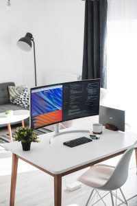
My top preference – if the architecture of the room allows – is to have the desk at a right angle to the window with a wall behind your back, allowing you a view of both the doorway and of the scene outside.
My top preference – if the architecture of the room allows – is to have the desk at a right angle to the window with a wall behind your back, allowing you a view of both the doorway and of the scene outside.
Space Planning
If you’re starting with a blank slate, rather than having to rearrange existing furniture, then you have an advantage to help you get the right pieces for your space.
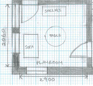
Space planning is the art (or science) of drawing a scaled map of your room, with the placement of the furniture – also drawn to scale. Get yourself a measuring tape, some graph paper, a scale ruler (this is important) and a pencil and eraser.
Measure your room and draw a plan with the dimensions in a scale of 1:50, including the doors and windows. Find the 1:50 face on your ruler and use it to scale down your actual room measurements to fit on the page. Draw out several blank room templates, so that you can play around with placing the furniture pieces in different spots.
Then, window shopping online, take note of the measurements of every piece of furniture you’re considering for the room. Draw them into your room plan (using rectangles, squares, circles to represent them) but ensure you’re also drawing these to scale. This will allow you to see on paper what will and won’t fit where.
Be sure to measure the space between furniture and convert that back to real-life measurements, so you know exactly how much circulation space each arrangement allows you. And if things feel tight, try a different layout.
If a particular piece in a given size won’t work on paper no matter how you shift things around, don’t kid yourself that you’ll be able to live with it. Accept the reality and go back to window-shopping for a more fitting piece.
Small Spaces
The smaller the space, the more limiting the room layout options will be. This will be even trickier if the furniture is large, and to avoid that many people opt for smaller pieces like two-seater sofas instead of three.
This isn’t always necessary though, and can often highlight the smallness of the room. Ironically, you can create the illusion of more space in smaller rooms by opting for full size pieces. The secret lies in the volume of space taken up by the piece.
A three seater sofa with deep cushions, wide arms and that goes all the way to the floor is going to take up a lot of space, both physically and visually. Avoid pieces like this like the plague. You don’t need to go tiny – just choose pieces that are less bulky.
In smaller rooms, opt for slim-line furniture that takes up less visual space.
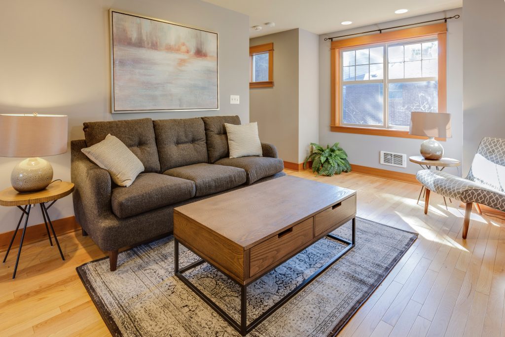
Choose sofas and armchairs with slim arms and backs rather than chunkier pieces and you may be able to comfortably fit in your three seater after all.
Additionally, go for items that are on legs rather than going straight to the floor. Being able to see more floor space beneath sofas, armchairs, sideboards etc increases the illusion of space.
And, most importantly, slimmer profile furniture also takes up less physical space. A few more inches in every corner gives you more options to play around with room layout – and improves your chances of getting it just right.
You might also be interested in:
Pro Tips to Elevate your Home Décor: Colour
Image Credits:
- Bedroom: Im3rd Media on Unsplash
- Home Office: Daan Stevens on Unsplash
- Small Living Room: Francesca Tosolini on Unsplash
- Slide 1: Curology on Unsplash
- Slide 2: Fran Hogan on Unsplash
- Slide 3: Norelyn Asupan on Unsplash
- Slide 4: Nasim Keshmiri on Unsplash
- Slide 5: Marah Bashir on Unsplash
- Slide 6: Israa Hilles on Unsplash
