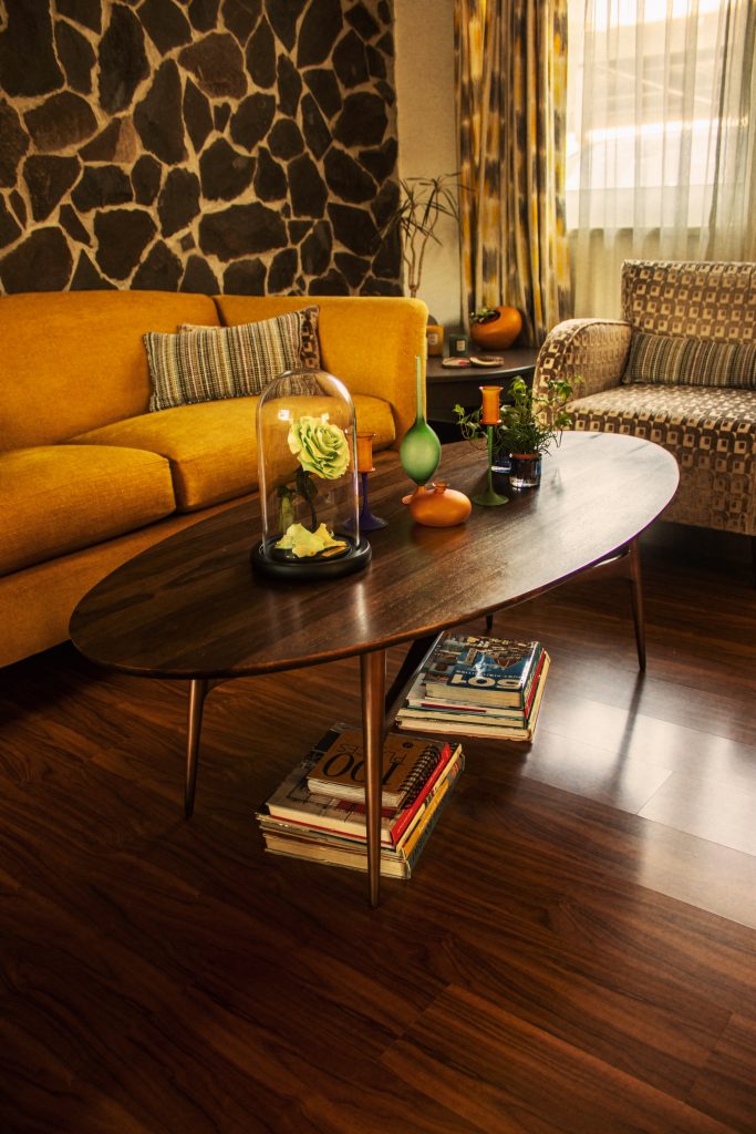
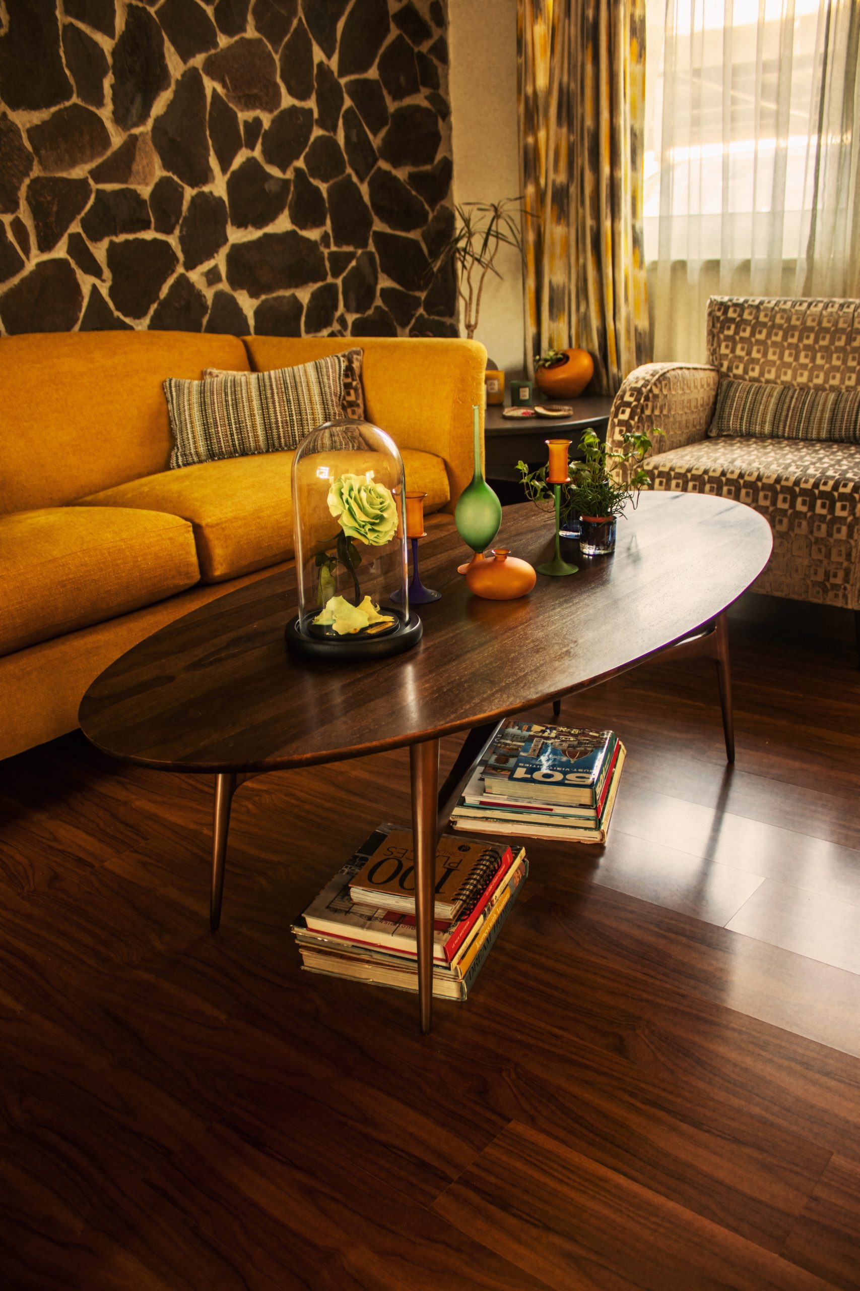
It’s not all about painting it white.

The most common advice when it comes to decorating a small space is to paint it white. And while this has its merits, it won’t always work.
White reflects light, and this can help a room to feel more spacious. But if the light coming in is northern (in the northern hemisphere), the room will never be bright enough.
Not to worry, because there are several other tricks we can use to create the illusion of spaciousness.
And many of them relate to furniture choice.
Let’s start with the obvious: avoid over-sized furniture.
All pieces need to be correctly proportioned for the space available. It’s frustrating to be in a small room that is over-crowded with extra-large furniture. And, of course, it sucks the space out of the room, thereby over-emphasizing its small size.
That said, the converse is also true: don’t kit your room out in under-sized furniture either.
Compensating for the lack of space by choosing smaller furniture is a common mistake. It has a sound logic: a two-seater sofa will take up less space in a small living room than a three-seater. Similarly, a casual chair is often thought a better option than an armchair.
But these smaller pieces tend to highlight the smallness of the room. And while you’ll have more physical space, you won’t have a sense of spaciousness. And that is important.
Of course, if a two-seater is needed to keep everything in proportion, that is the right choice. But if you have the space for a three-seater, then this is something to consider.
The real trick is in the volume of the piece rather than its length or width.
You want to choose slimline furniture. Chunky furniture is going to take up visual space as well as actual space. So avoid the marshmallow pieces and choose something with slim (or no) armrests. The backrest should have enough cushioning to be comfortable, but not so much that it’s adding more than necessary to the depth.
A slimline three-seater sofa — that isn’t crammed into the space — can help the room to look and feel larger than it is. The extra length, compared to a two-seater, tricks the eye into thinking the space is wider.
The other key thing with furniture choice is to opt for pieces that are on legs.
From your seating to your coffee tables and sideboards. You want as much of it as possible raised off the floor. The more floor space you can see, the greater the illusion of space.
Use reflective surfaces.
You may already know about the mirror trick. Mirrors reflect light and can be your best friend in a small space. Hang one opposite or near a window to help increase the natural light.
And you can get similar benefits from glass tabletops, metallic finishes, and glazed ceramics. All can help reflect and bounce light around the room. And the more natural light there is, the more spacious it can feel.
Tricks with paint.
Choosing a paler color is a good idea. Lighter colors appear to recede from us. And darker colors appear to advance towards us. This is why darker-colored rooms tend to feel smaller.
You could paint the ceiling the same color as the wall (if you’re not doing white walls). A contrasting ceiling clearly defines the height of the room. So if your ceilings are on the low side, removing that boundary creates an illusion of added height.
And you could do the same with the doors, architraves, and baseboards. Again, if they blend in with the walls, you blur the boundaries of the room. The starker the boundaries are, the clearer the size of the room is.
Don’t breakup the flooring.
If you have an open-plan layout, choose the same flooring throughout. If you have tiling in the kitchen-dining area, then wood or carpet in the living area, you visually break up the space. Of course, you do want to zone different areas for their different functions. But you want to do it without interrupting the visual flow.
Instead of using different flooring, use a rug to zone the living area. And go as large as you can. A rug that all your seating sits on (even if only partially) will help to trick the eye. It draws it under the (raised) furniture, again giving the illusion of more floor space. A rug that sits in front of your seating, with only a coffee table on it, will make space visually contract.
Storage and shelving.
In a small space, it’s vital to keep visual clutter to a minimum. The fewer items vying for your eyes’ attention, the more spacious it will feel.
Closed storage will help with this, for sure. But if you love the look of open shelving, keep it simple. Don’t cram every inch — allow space. Heavily laden bookshelves can make a room feel closed in. Thinning out your collection can bright a surprising lightness to the space.
And if you’re storing more functional pieces that don’t add to the décor, use baskets or other attractive containers to keep them out of sight when you’re not using them.
While we can’t create more physical space without knocking down walls, there is plenty we can do to create the feeling of spaciousness. And a comfortable, nurturing home is all about how it feels.
Start with a declutter and see the difference that makes. Then, over time, add in other elements that will help create the effect you want.
Originally published at https://www.newsbreak.com.
You might also be interested in:
Key Colour Effects to Consider before Hitting the DIY Stores.
