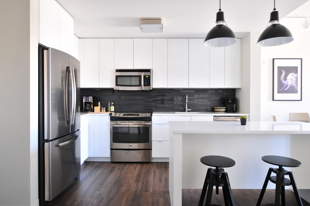
Photo by Naomi Hébert on Unsplash
I was half way through my interior design course before I hit the colour module and got something of a shock:
Contrary to popular opinion – including no shortage of high-profile professionals in the field – monochrome is not black and white.
And now, whenever an architect on the telly describes a black and white scheme as monochromatic, I want to throw something at the telly!
I don’t know who’s responsible for first sowing this seed of misinformation, but it has propagated like wild fire. And once you know it’s wrong, you can’t un-know it.
And you want it to stop. So I’m on a mission to bust the myth.
Read on if you’re interested to know why black and white isn’t monochrome, what it is, and how do all the other colour schemes work.
The true Monochrome.
The clue is in the name, and when you break down the meaning of “monochrome”, you’ll never make this mistake again.
Mono means one. Chrome means colour.
So, a monochromatic scheme is made up of one colour. It can have tints and shades of that colour but essentially it is a blend of different reds, or different greens, or different blues…and so on.


The False Monochrome.
The kitchen pictured above is achromatic, meaning no-colour. Because, strictly speaking, black is not a colour (all colours absorbed), white is not a colour (all colours reflected) and grey is either a tint of black (white added) or a shade of white (black added). So again, strictly speaking, grey is not a colour (which is why it works so well as a neutral backdrop to a décor scheme).
Both achromatic and monochromatic schemes are good choices if you want a subdued and restful palette. Another option, but with slightly more variety in colour choice would be an analogous scheme.
Analowhat?
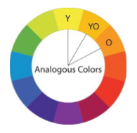
An analogous colour palette incorporates three colours which sit beside each other on the colour wheel. So, while they could include a yellow and orange, the third colour will sit between yellow and orange. Similarly, a yellow and green scheme would also have a yellow-green colour included. While similar, it does offer more nuances than the monochromatic scheme. One colour usually dominates and the other two are used as accents.
Getting Daring with your Colour Choices.
For more colour variety and contrast, consider one of the following schemes: complementary (two colours), split-complementary (three colours), triadic (three colours) or tetradic (four colours).
In a complementary scheme we work with two colours that sit opposite each other on the colour wheel. Vibrant and stimulating, it works best if one of the colours is more dominant and the other an accent, rather than giving both colours equal share in the space.
Using two pure complementary colours can be quite intense, so be mindful of the effect it will have in the space. More subdued tints or shades of two complementary colours can have an equally exciting and interesting result, with less intensity.
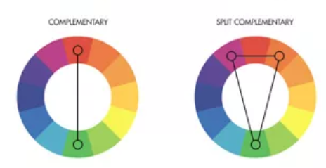
If you do want to use a pure colour (untinted red, blue, green etc), then consider opting for a split-complementary scheme. Here, instead of pairing your main colour with its direct opposite, you’d pair it with the two colours that sit either side of its opposite. This gives a more subtle complement, but the overall effect is just as interesting and dramatic as a complementary scheme.
Another vibrant, three-colour option is the triadic scheme, which is composed of three colours that are equidistant from each other on the colour wheel. In this case, we use either the three primary colours (red, yellow and blue), or the three secondaries (orange, green, violet) or three tertiaries (yellow-green, yellow-orange, blue-green, blue-violet, red-orange, red-violet).
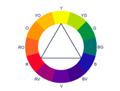
It can be a popular choice in kids’ rooms – especially using the primary colours which offer great vibrancy and stimulation. Having said that, the primary colours are better for a playroom than a bedroom, where the more subdued effect of tertiary colours might be a better option. There will still be lots of variation for interest, but less stimulation when it’s time for sleep.
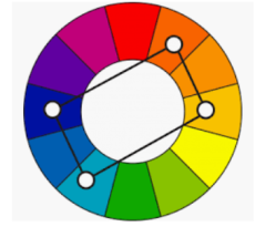
Tetradic gets even more interesting by adding a fourth colour to the palette. To identify your palette, choose a complementary pair that you’re drawn to and then draw a rectangle on the colour wheel with one colour range sitting between your two complementary ranges. These four colours will work together, providing lots of variety and options for a rich and interesting colour scheme. However, for maximum effect allow one colour to dominate and use the other three as accents.
How to make it all work.
Some people have a natural aptitude and can put colours together easily, but if it’s a challenge then a colour wheel such as the one shown here is a great tool. It can help you put together a harmonious colour palette that works around a particular colour you want to have in a room and you can pick one up in an art and hobby shop, or online.
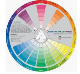
Starting with a colour you love, use the wheel to help you choose the rest of your palette, bearing in mind what kind of mood you’re looking to create.
If you want a vibrant space, look at complementary, split-complentary, triadic and tetradic options. If you want something more calming, look at monochromatic, achromatic and analogous options.
Use the wheel to help you select the best tint or shade when the pure hue will be too intense for your needs. Of course, these can also help to change the feel of a room, with darker shades making things feel cosier and lighter tints bringing in a sense of airiness, even to smaller spaces.
We don’t need to be able to remember the name of the colour palette we’ve selected – the wheel is there simply to help us make choices that will work harmoniously, no matter what kind of effect we’re looking for.
But if you are going to use labels please remember, monochrome is not black and white. 😉
