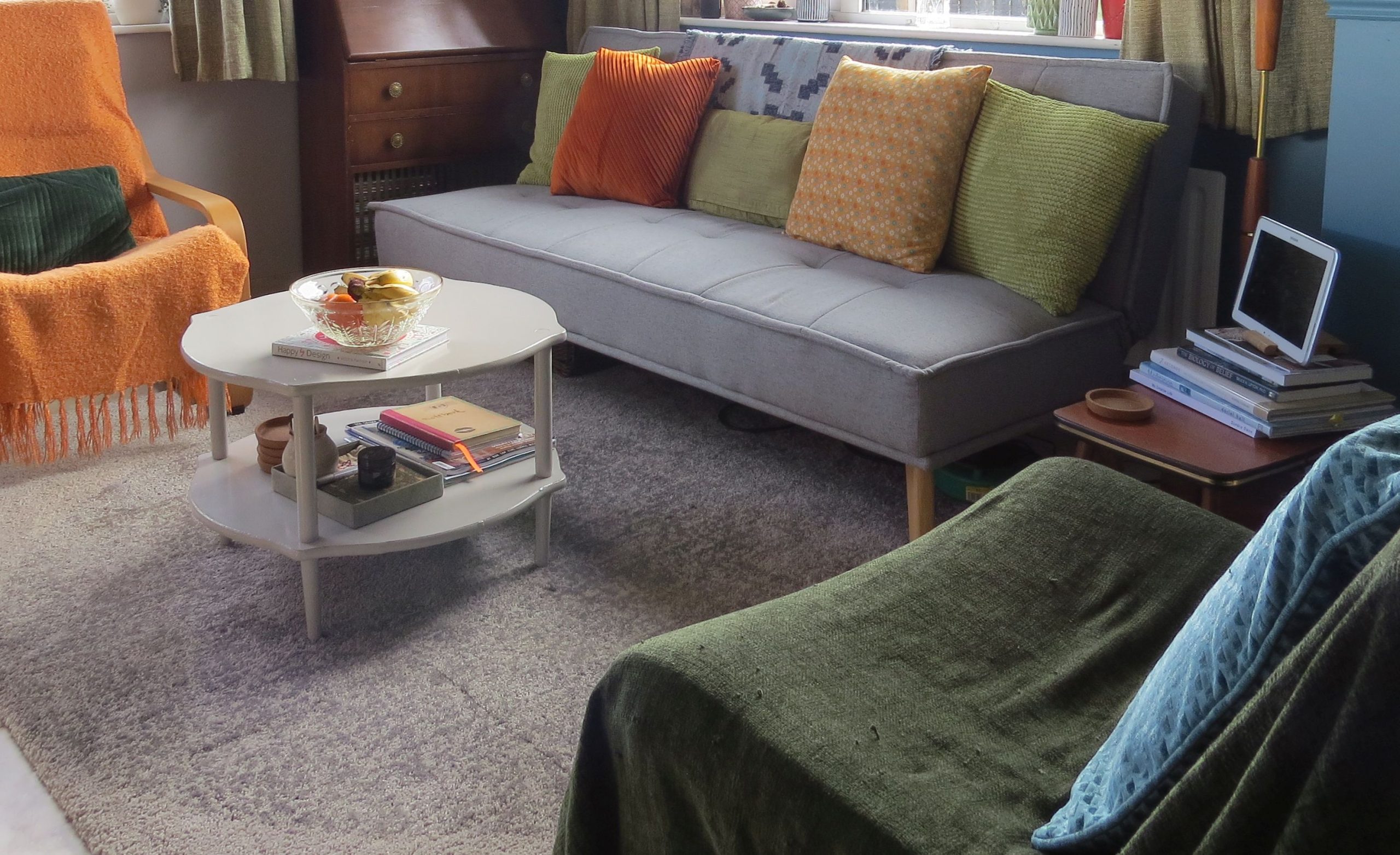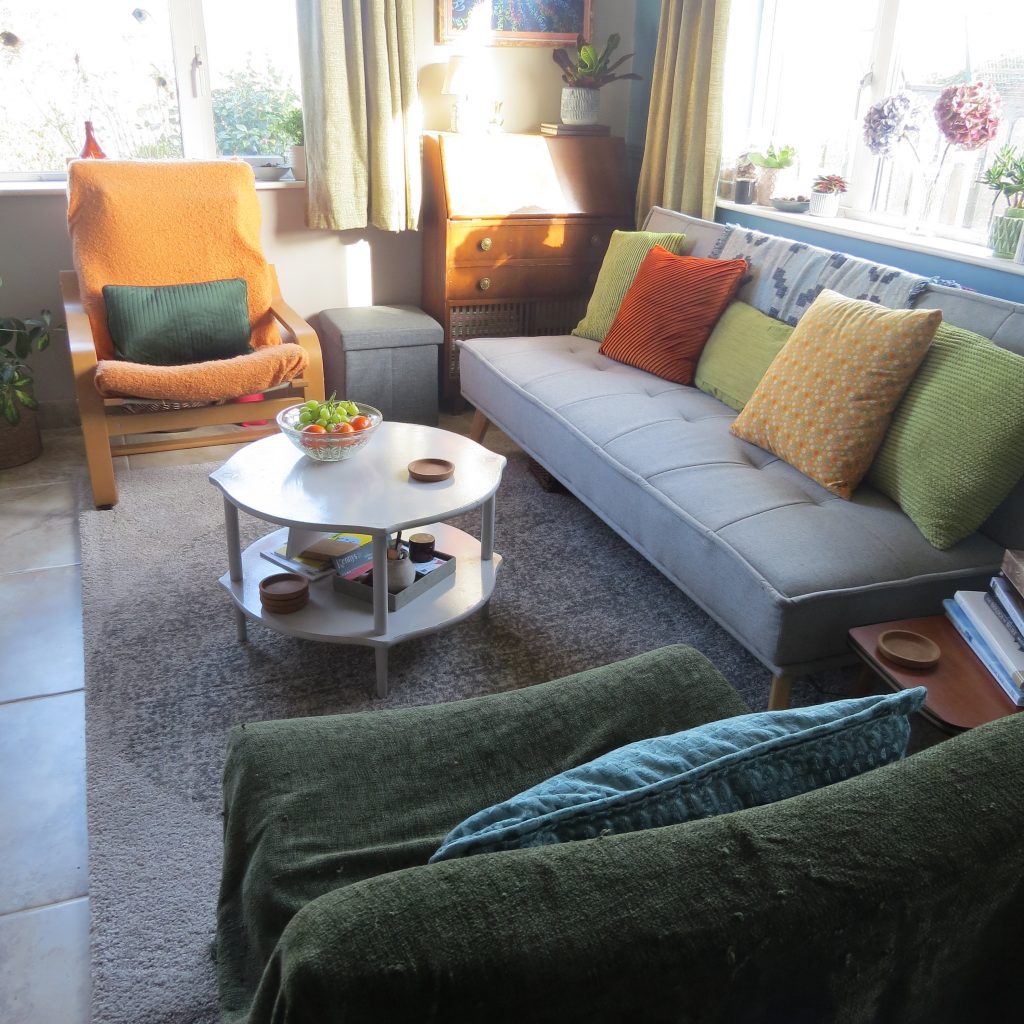
I recently gave my living room a bit of a makeover and I’m going to share here some tips for making small spaces feel bigger. In interior design there is some conventional advice for how to decorate small spaces that has a sound logical basis.
Number one on the list is to paint the room or area a light colour, white being the top recommendation. Because white and other pale colours reflect light, painting your walls and ceiling accordingly can help make the room feel bigger.
Conversely, black and dark colours absorb light, and a dark room generally tends to feel smaller than a light room.
There is another dimension to the light colour advice, and that is that paler colours appear to recede while darker and stronger colours appear to advance towards us. So with lighter walls appearing to move farther away from us, the space feels larger. And as darker walls feel like they’re closer to us, the space will feel more cramped.
With this knowledge it makes perfect sense to paint smaller rooms light colours to make them feel more spacious, and paint larger rooms darker colours to make them feel cosier. But as I’ll explain shortly, we don’t always need to follow this advice. If your heart is set on a particular colour – and it’s in a strong dark hue – there are other ways to make the space feel, well more spacious.
The other piece of conventional wisdom is to avoid having large furniture in small spaces, as overcrowded spaces will always feel small. This one is a bit of a tweak on what an interior designer would actually advise, which is that the furniture should always be properly scaled for the space it’s in.
However, this doesn’t always mean that smaller furniture will make a room feel larger. In a room that can comfortably take a larger piece, putting in a smaller piece might actually emphasise the lack of spaciousness rather than counteract it.
It is not only ok to put a three seater sofa in a smaller living room – it could help the room feel more spacious than a two-seater would if the piece isn’t ridiculously oversized in proportion to the room itself and all the other pieces of furniture in it.
It is good to know and understand the conventional guidelines, so that you also know when you can break them, and still create a harmonious and balanced effect in the space.
In my recent refresh I made three simple changes: a new wall colour, a new sofa and a new rug.
[masterslider id=”3″]
With a white dado rail, the room was previously painted grey on the lower section and magnolia above. Now it’s painted teal blue from top to bottom on three walls, and grey on the fourth wall. (This is not a feature wall, but a wall shared with the open-plan kitchen where the blue would be too strong with the existing colour scheme).
Effectively, we’ve gone from a paler backdrop to a darker one.
The room does have dual aspect windows – one facing North-East and one facing South-East. They do bring in good light in the mornings, especially during spring and summer. But even during the brighter times of year, the light in this room is much duller from midday onwards. So we would expect painting it a darker colour to make this small space feel even tighter.
And yet, it feels the opposite. This small room feels much more spacious than before despite the darker colour. The magical antidote to the darker walls is the size and colour of the new rug and sofa.
The new sofa is a three seater, whereas the former was a two seater, so I have bucked the conventional wisdom again.
And this hasn’t made the room feel cramped at all. In fact, the sofa helps to counteract the effect of the darker wall and add to the overall roomier feel. There are four factors that help to achieve this effect:
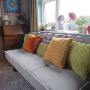
- The extra length in the sofa helps to make the space it sits in feel wider than it did when occupied by the old narrower sofa.
- The new sofa is a pale grey, compared to a dark blue before. As explained above, the old dark sofa would have absorbed more light than this new one is doing.
- The new sofa is on legs, while the old one went all the way to the ground. In a small space, furniture raised up on legs that allows us to see floor space underneath is a much better option. Being able to see more floor space contributes to the illusion that there is more space overall.
- The new sofa has a much lower and slimmer profile and takes up far less visual space, even though it is a physically larger piece of furniture. Chunky pieces aren’t friends to small spaces – the sleeker the better. And sleeker can often allow you to fit something bigger in if its visual weight is proportionally in keeping with the available space.
The new rug has also helped to make the space feel roomier despite the new darker walls.
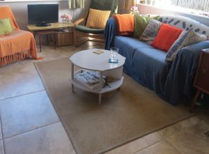
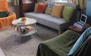
And again, this is due to the combination of its light colour and larger size. Large enough for all seating in the room to partially fit on the rug, and running underneath the sofa, it is also helping to create the illusion of a larger space.
The end result of this little refresh is that, when sitting in this room during the day, it feels a lot more spacious than it did before.
And this is despite the new layout. Previously the armchairs were placed so as to open up the sitting space more. Now, the layout encloses the sitting space and it still feels bigger than before.
In the evening, when the curtains are drawn and the lamps are lit, the room feels about the same as before space-wise. However, the darker colour has made it feel much cosier as an evening retreat.
One last helpful tip…both these windows had a dark roller blind, which I never used. Although they were rolled up quite high, I did remove them altogether and this too will have helped introduce more light.
Still to come… a larger coffee table surface. This one is not quite the right size. And I plan on painting the door the same colour as the wall. So watch this space….
